Day Digital

Day Digital offers an intranet platform that can easly be implemented within small to medium sized business environments. We advised on their interface layout as well their print campaign.
• Visual Identity:
Colour palette, Typography, Photography
• Brand Expression: Press Ad, Intranet Interface
• Brand Expression: Press Ad, Intranet Interface
Visual identity
Typography
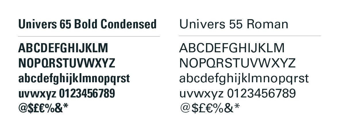
Typography
A Swiss typeface for a Swiss product. Univers is discreet, neutral and adaptable, perfect for a product requiring deployment within a multitude of diverse corporate environments. The condensed cut proves particularly useful in situations requiring long headlines.
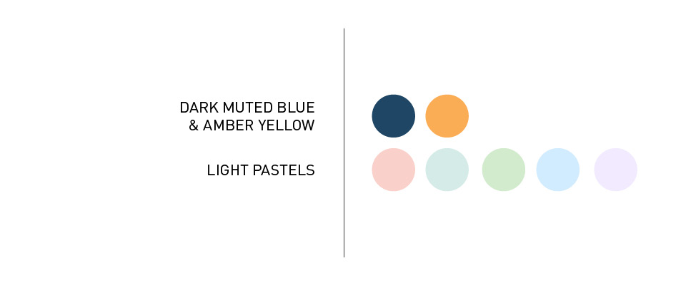
Colour Palette
Dark muted blue was chosen to contrast the existing amber yellow.
Light pastels were selected for discreet highlights within the interface.
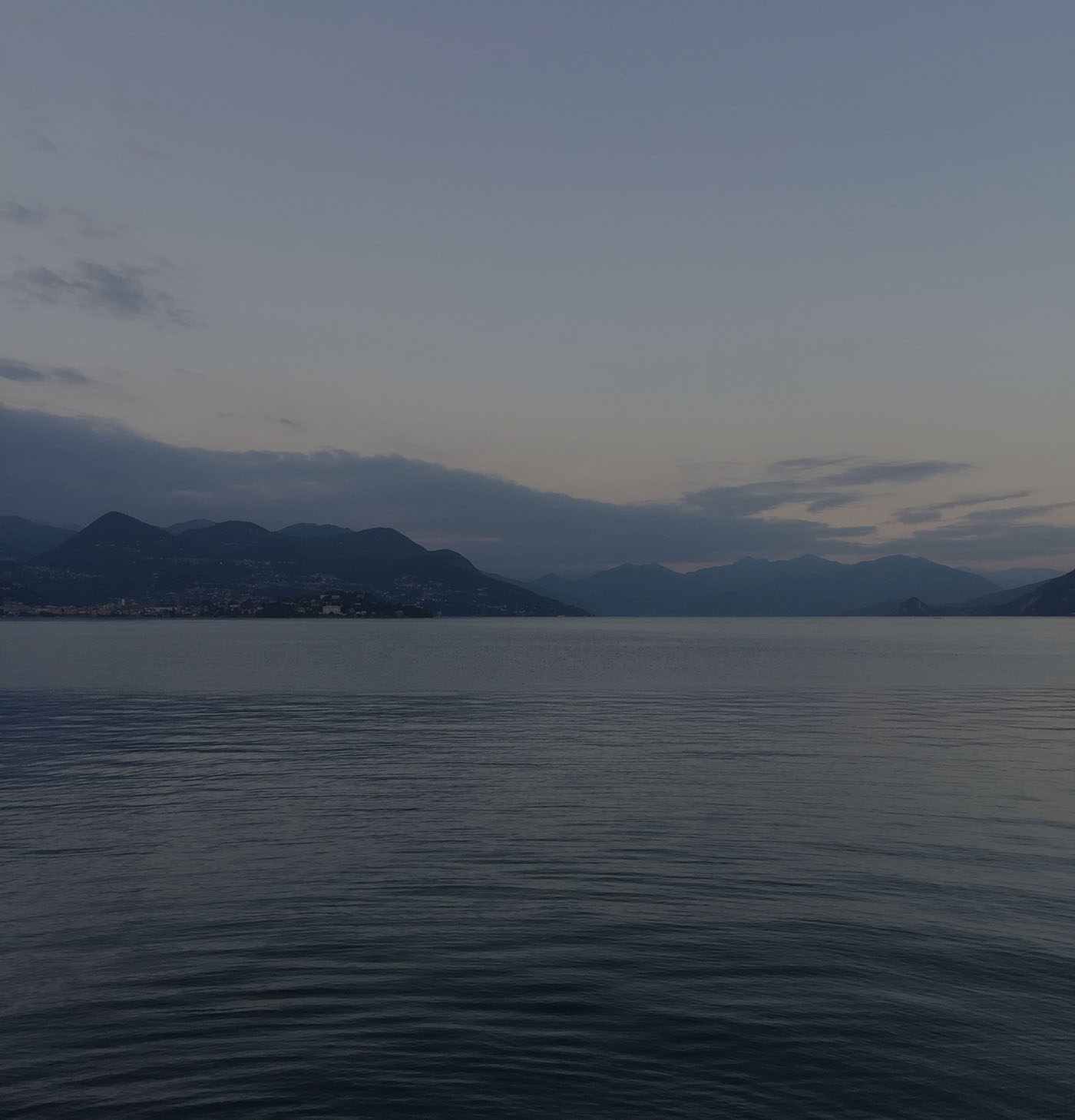
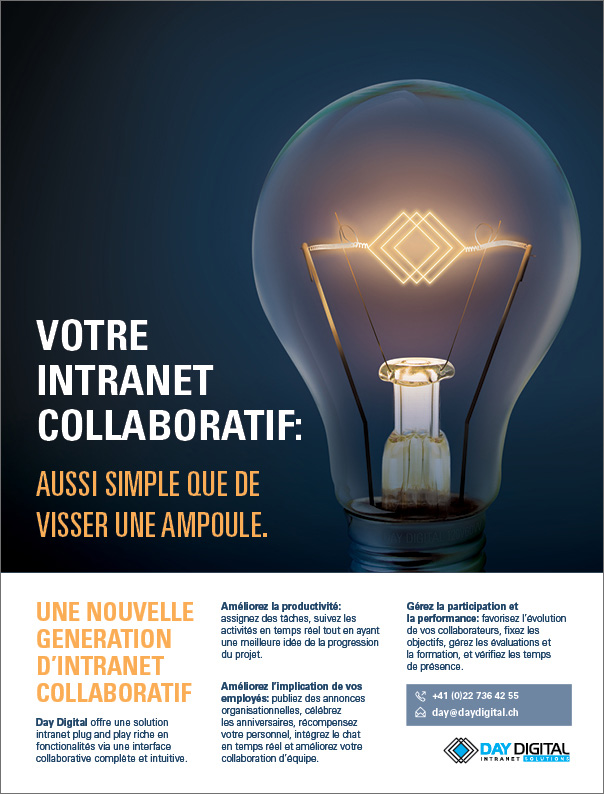
Photography
Shot for this product, this photograph offers a soothing and quiet environment that allows the interface to breathe.
Brand Expression
Press Ad
Press Ad
Highlighting ease of use and installation was a priority for the client. The key message of this campaign: "as easy as screwing in a lightbulb", technology that simply works. The copy focused pragmatically on highlighting the key benefits of the product.

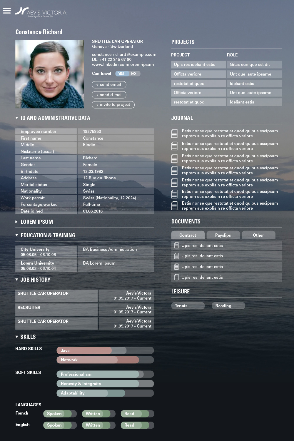
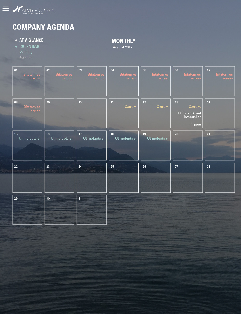
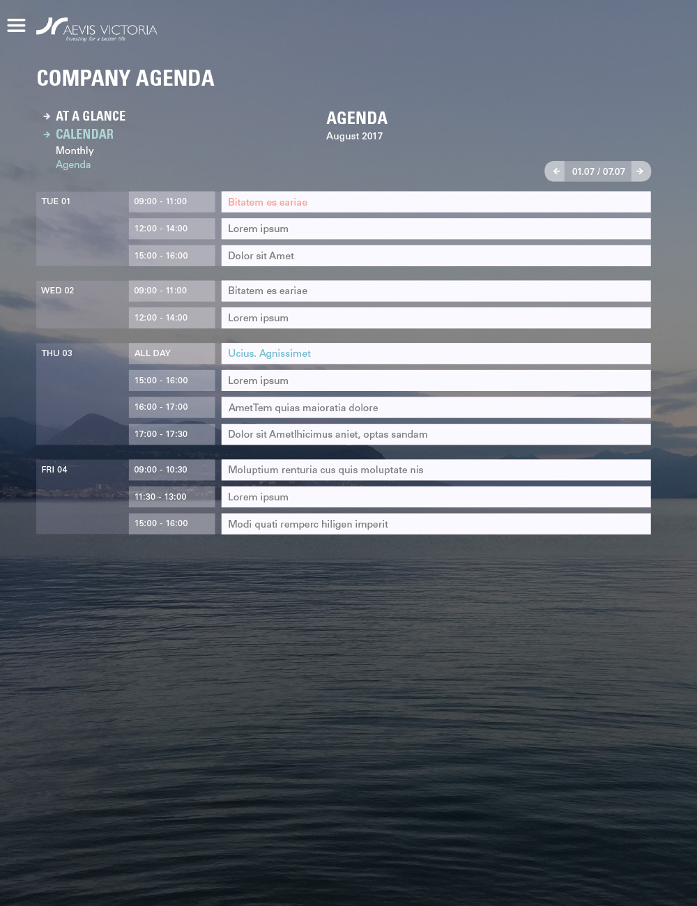
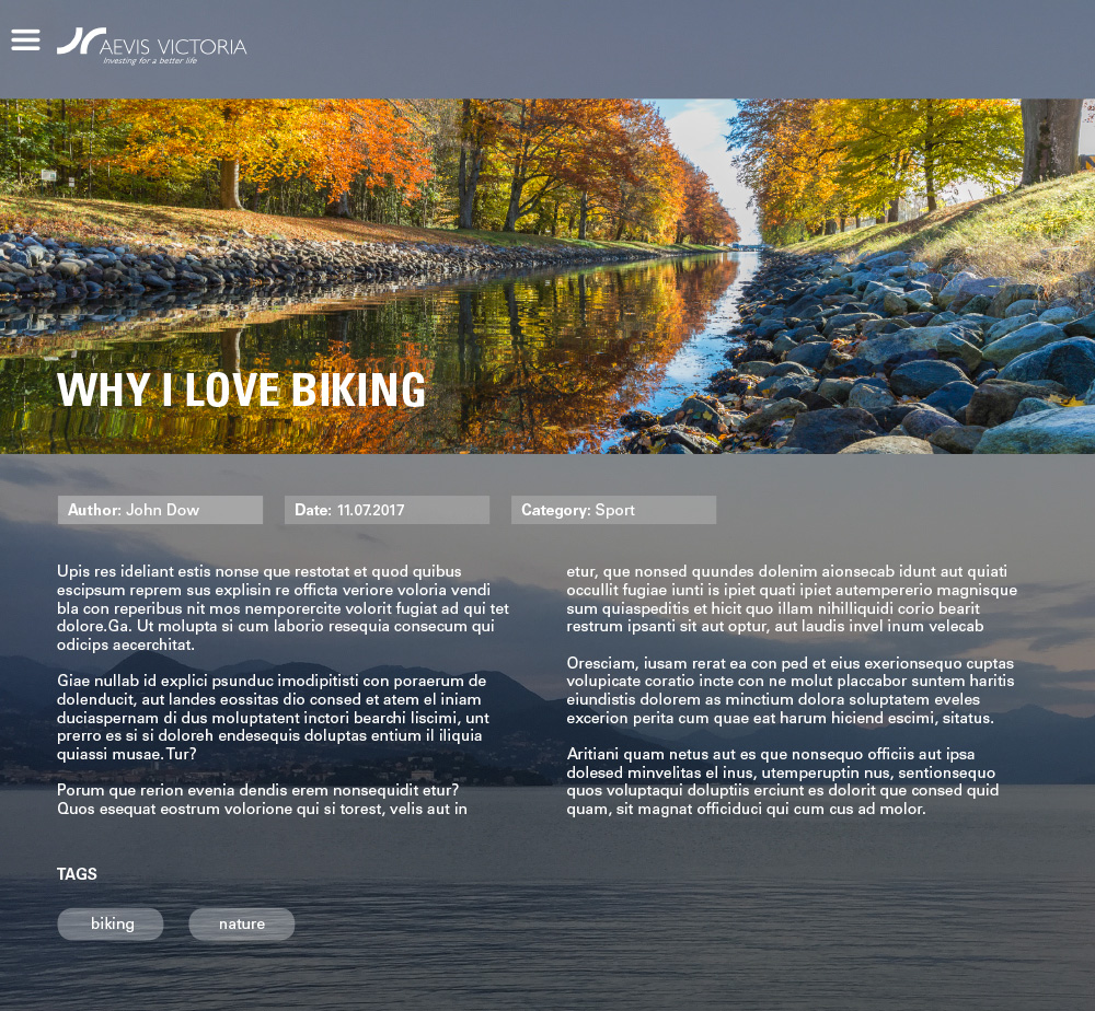
Intranet Interface
A transparent interface providing comprehensive access to important information without overwhelming the user.