Harvester

Harvester wanted to reposition itself as health conscious and wholesome while still being a good bargain. This involved a full rebrand starting with the logo. Given the size of this restaurant chain, this had far reaching implications on all brand collateral and care was taken to create a solution that would be easily rolled-out.
• Visual Identity:
Logo, Colour palette, Typography, Visual style, Iconography
• Brand Expression: Point of Sale, Menus, Instore Material, Press Ads, Signage
• Brand Expression: Point of Sale, Menus, Instore Material, Press Ads, Signage
Visual Identity
Logo
Logo
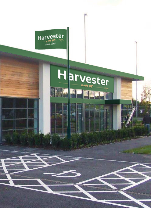
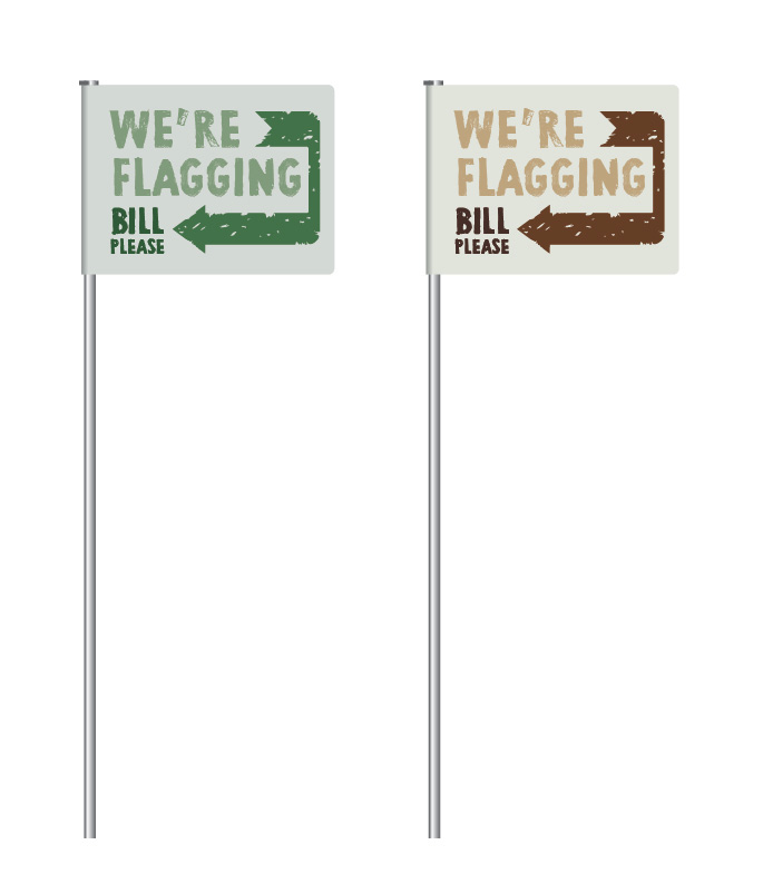
The Harvester logo uses a bespoke typeface, insipiring wholeness, nature and warmth. While this is a unique face, the font is classic enough to not go out of fashion quickly, an important consideration given the investment the business will be making in signage and collateral.
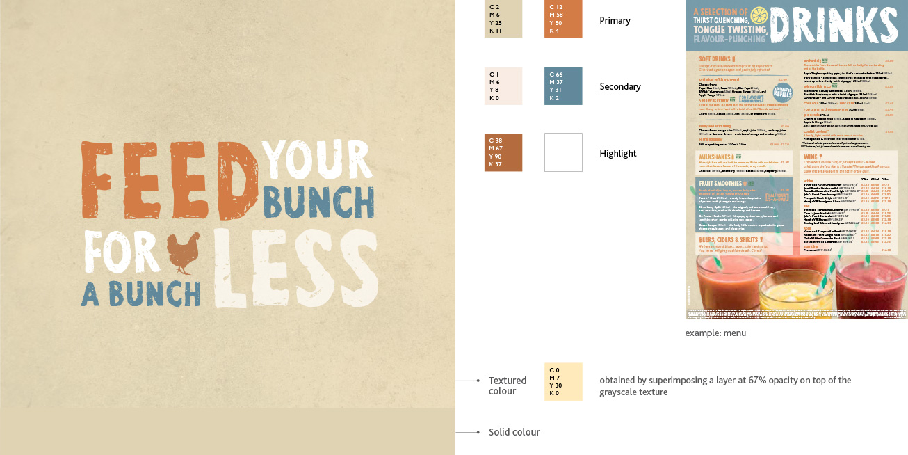
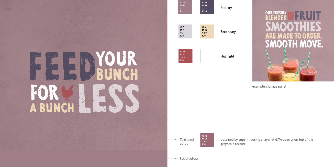
In print comms, a strip based on the strongest colour in the layout holds the logo.
Typography
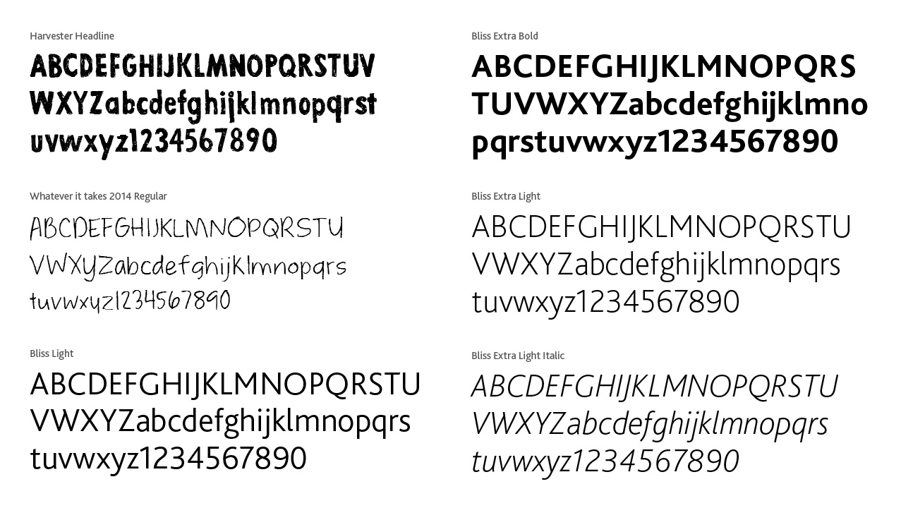
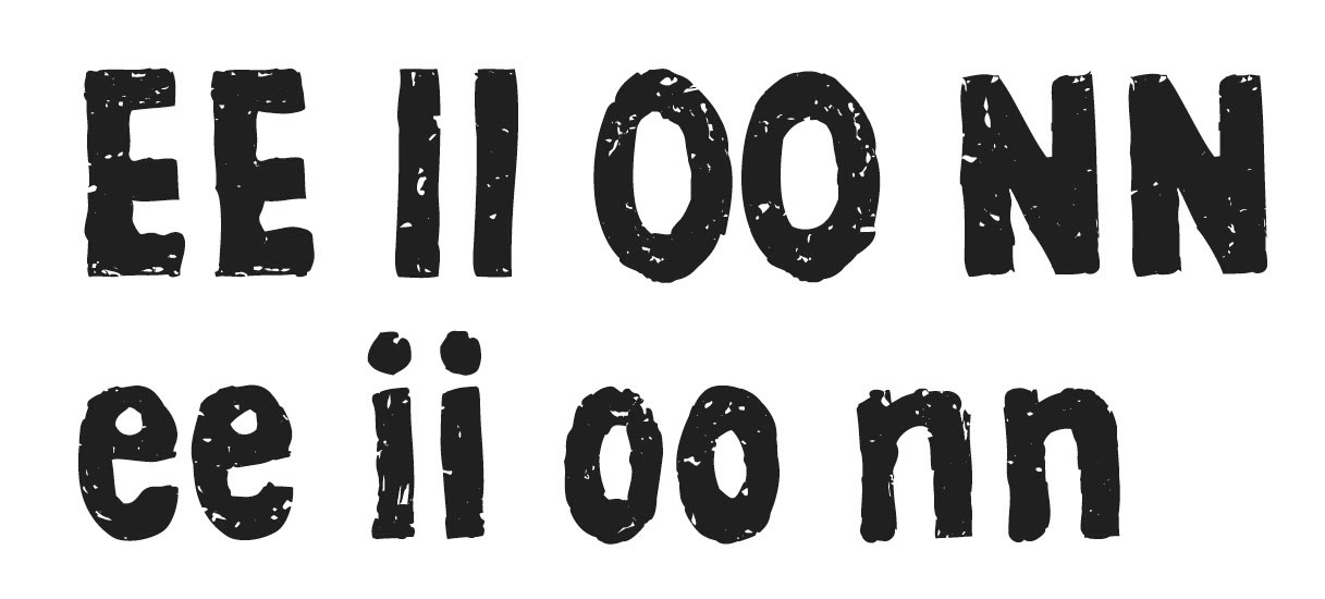
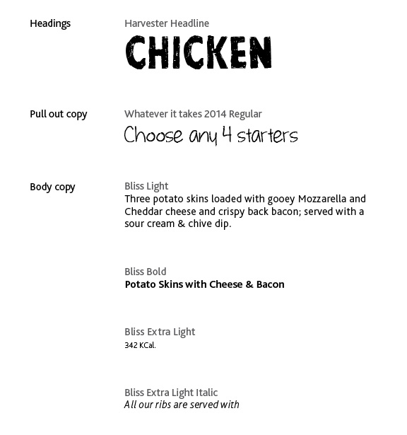
A custom typeface was developed for Harvester in accordance with the new visual style. Due to the texured nature of the typeface, the font automatically detects double letters and offers a degree of variance between two identical adjacent characters. The typeface 'Whatever it Takes' was also revised into a new version. Bliss, an extremely legible typeface is used in all body copy.
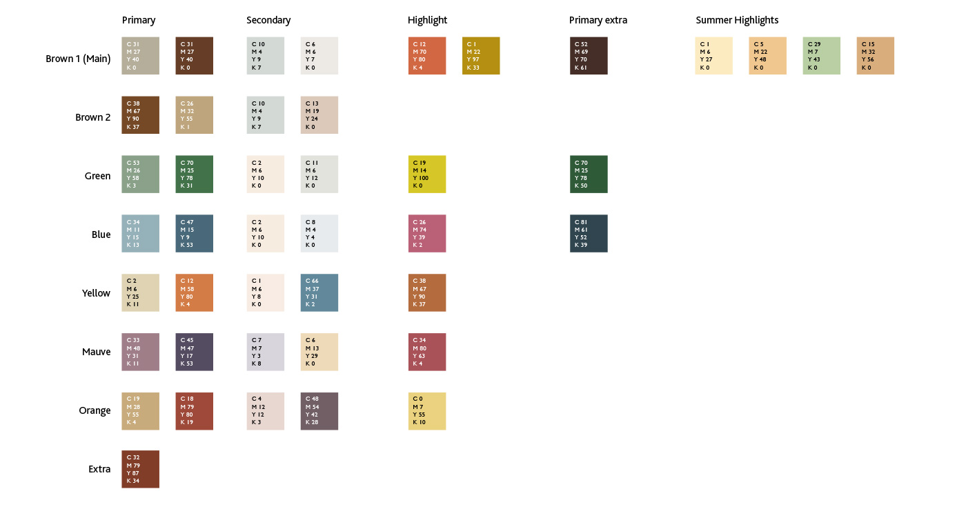
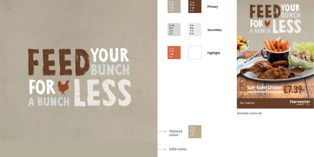
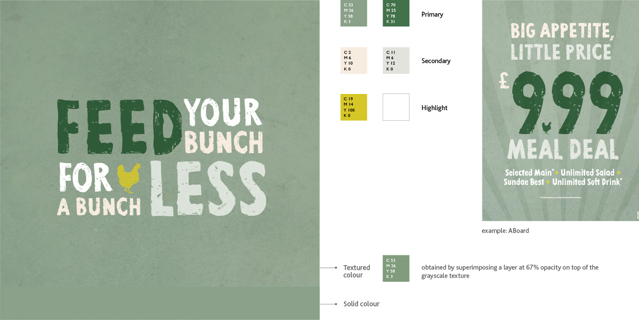
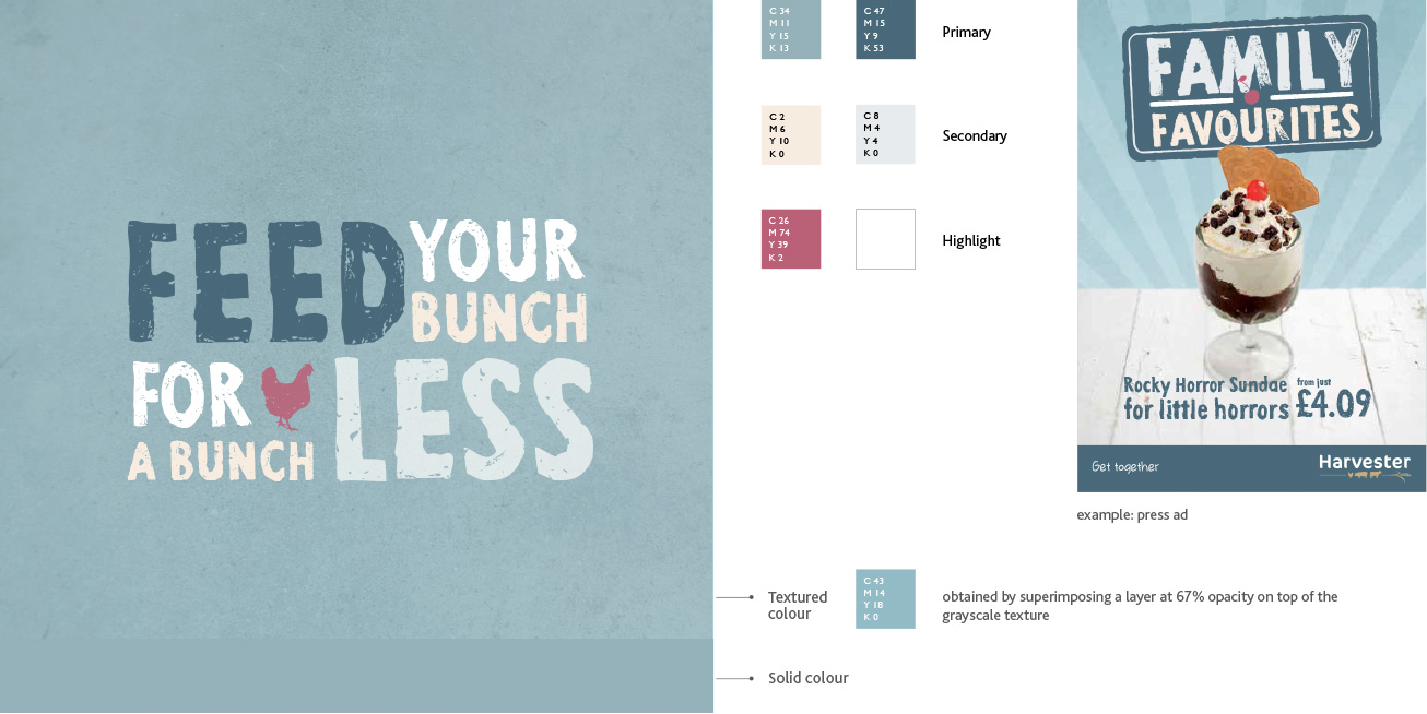
Colour Palette
The color palette is divided into six main groups. Each group consists of two primary colours (typically used as background and main), two secondary colors and optional highlight colors. Some groups have an additional primary. The examples below illustrate how the palette comes to life in layouts.
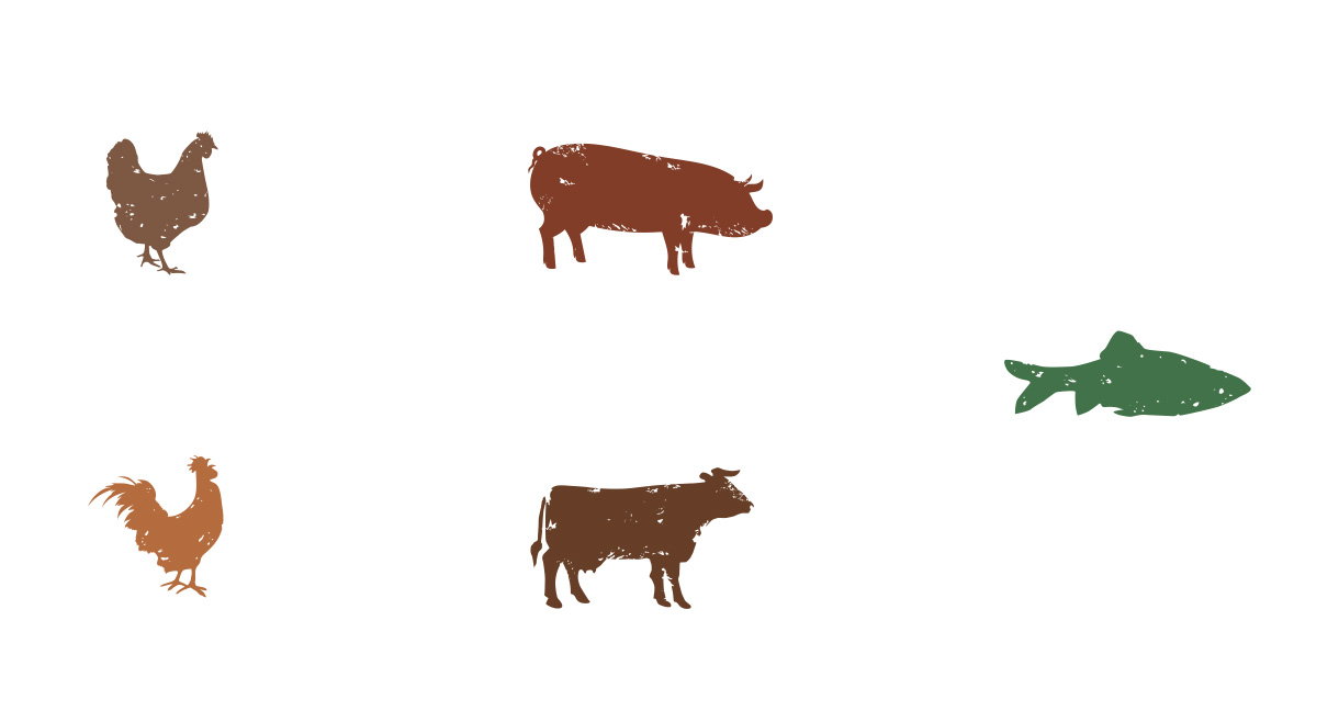
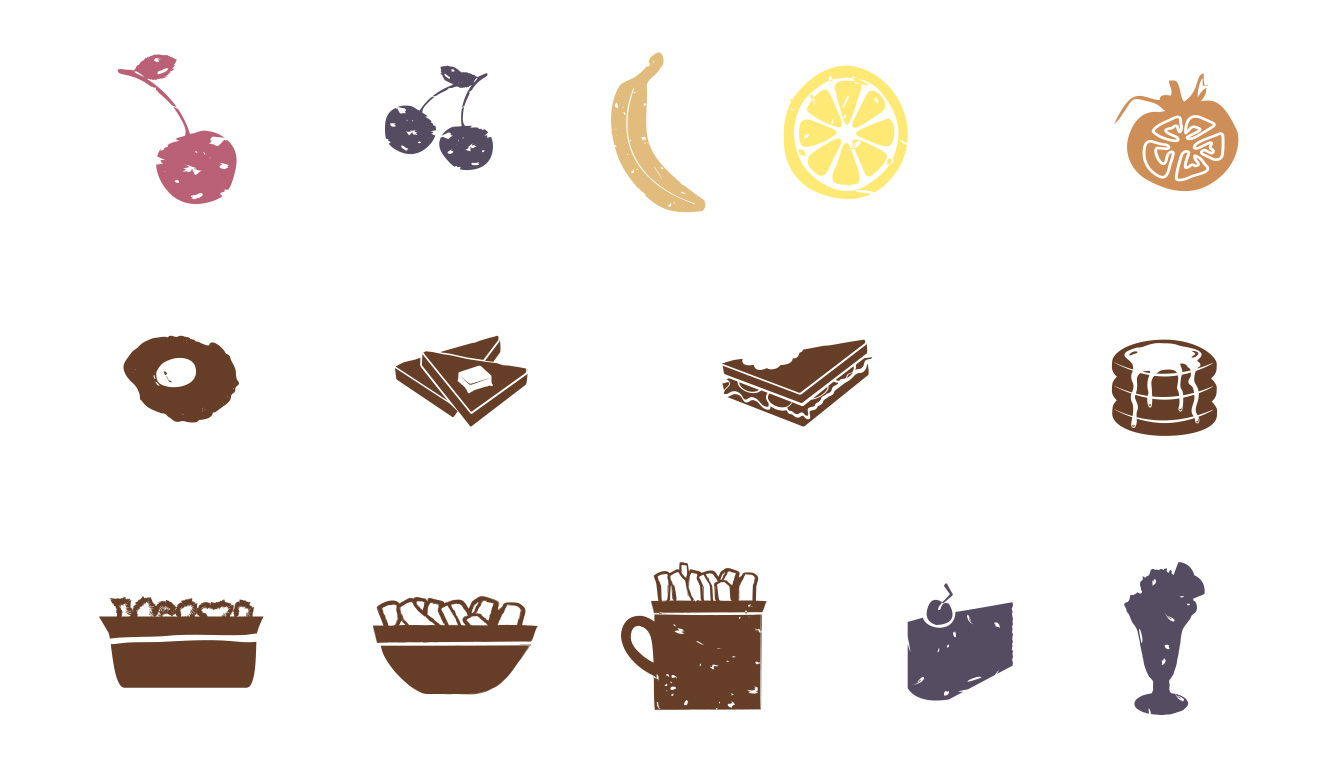
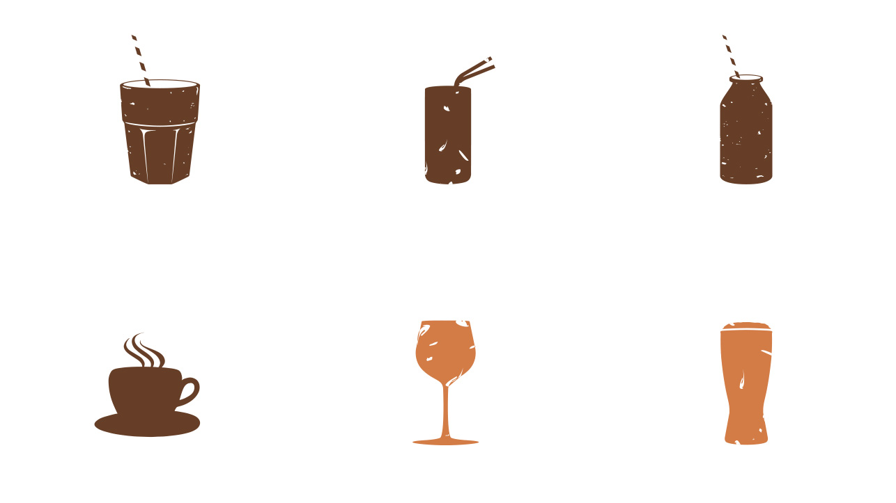
Iconography
Brand Expression
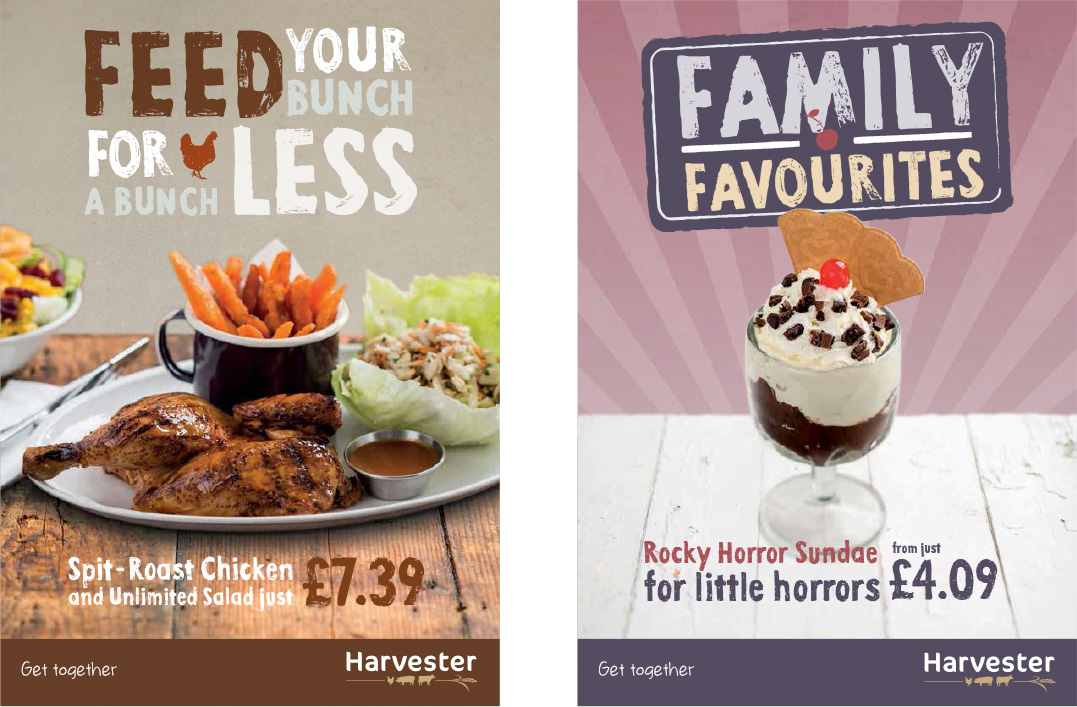
Point of Sale
Point of Sale
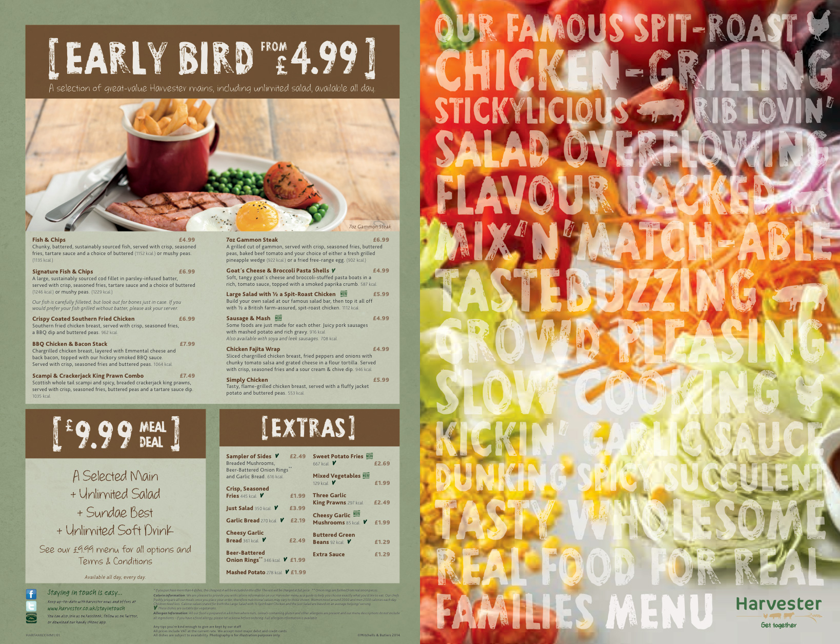
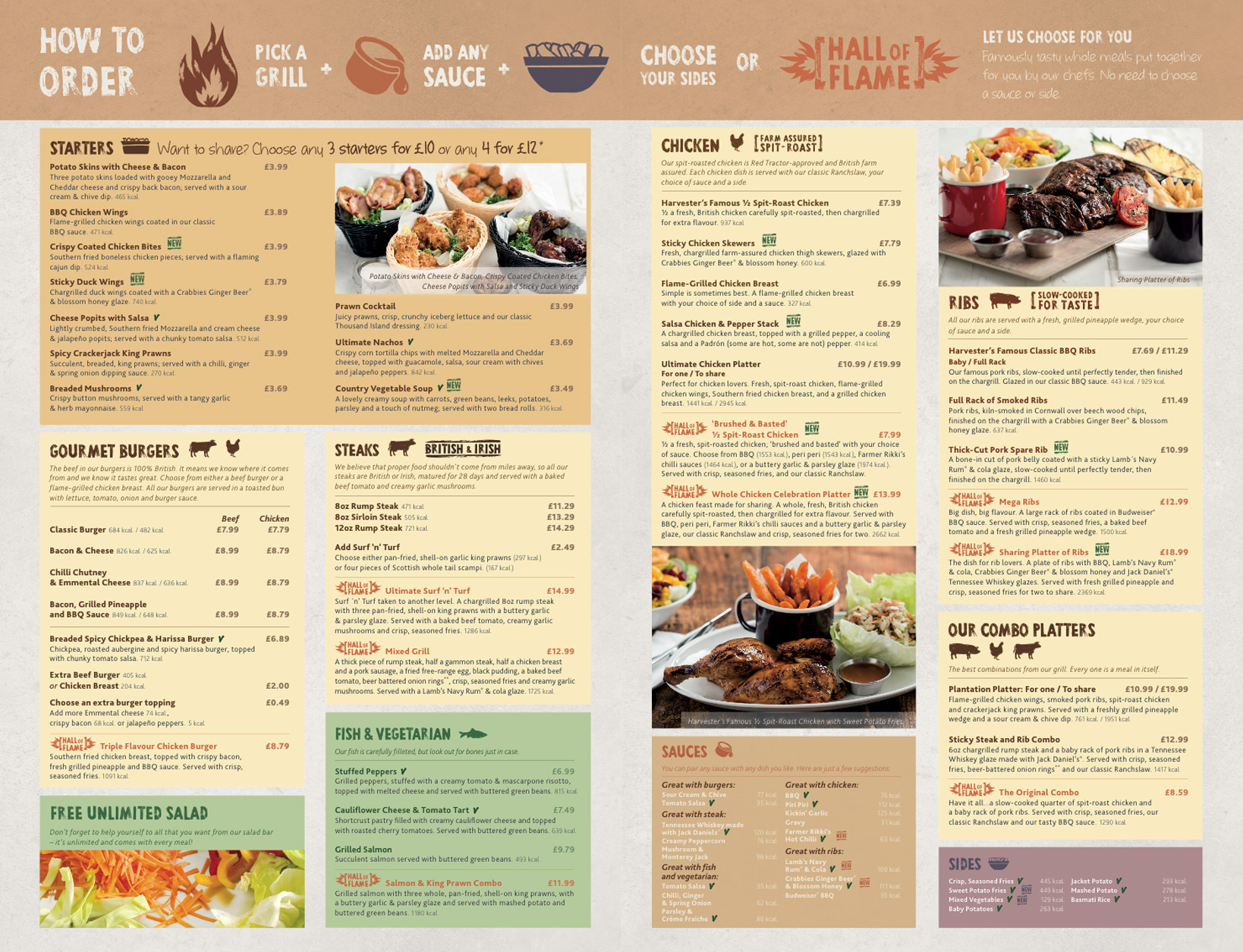
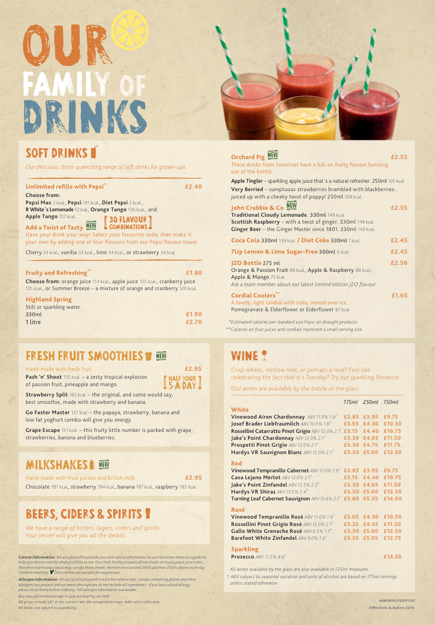
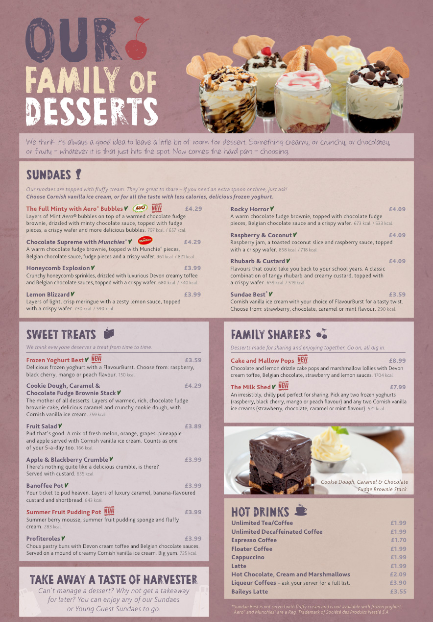
Menus
Instore
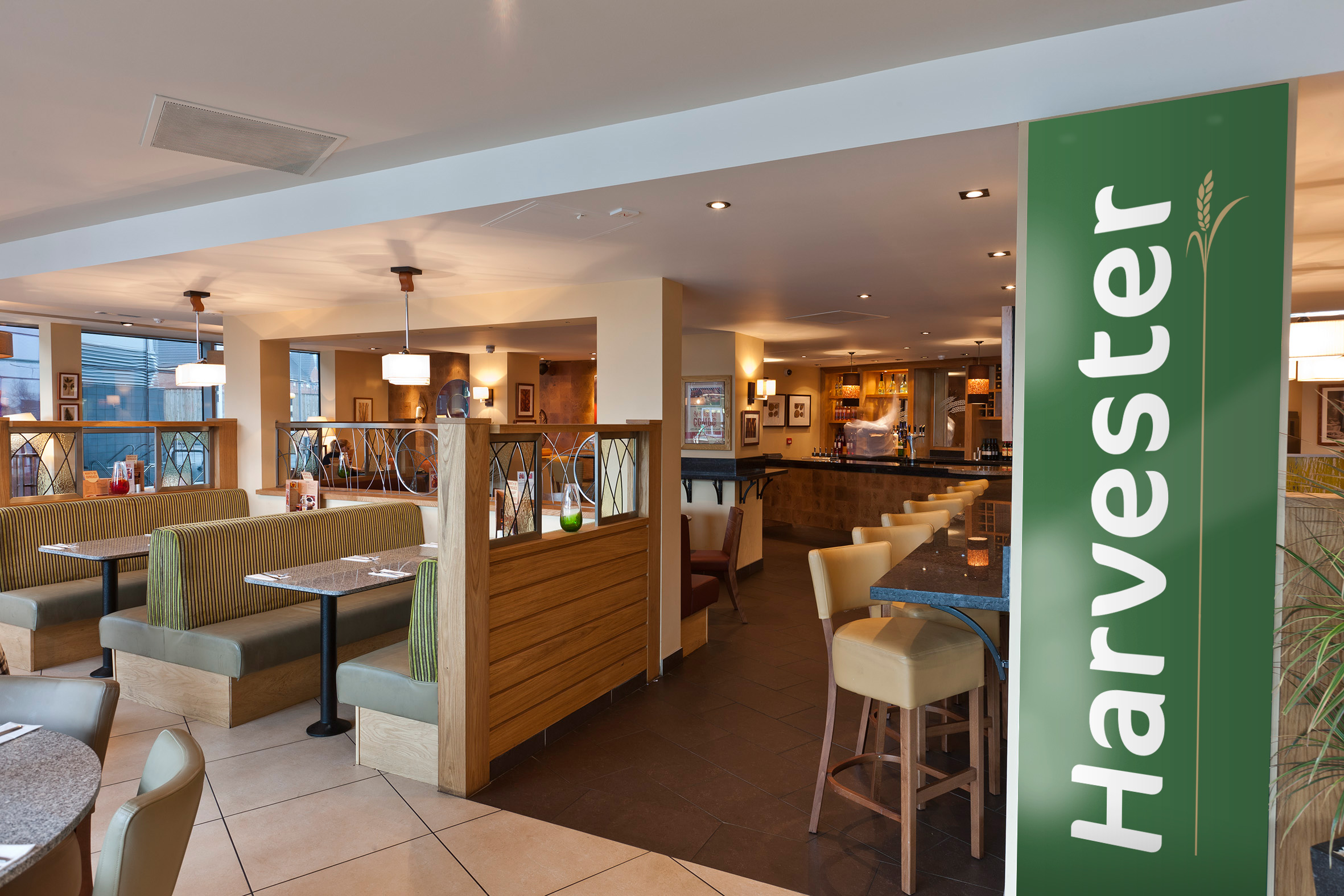
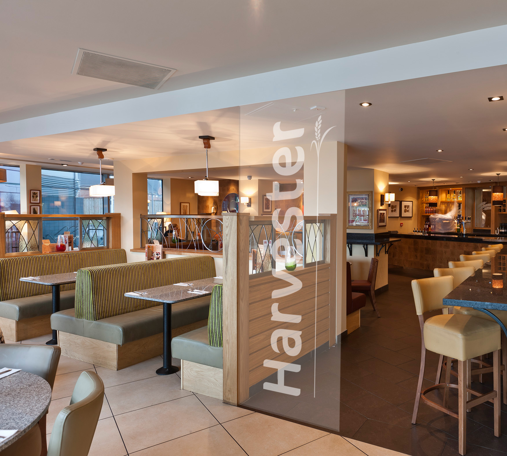

Storefront