Mazal Group
Taking a three generation family business to the next level meant setting up a company and creating a unique brand to support it. We developed a corporate and a product brand that conveys the original business values and importantly is able to differentiate itself from same sector competitors.
• Identity:
Logo, Colour palette, Typography, Key visual
• Brand Expression: Packaging, Leaflet, Website
• Brand Expression: Packaging, Leaflet, Website
Identity
Mazal Group
Logo
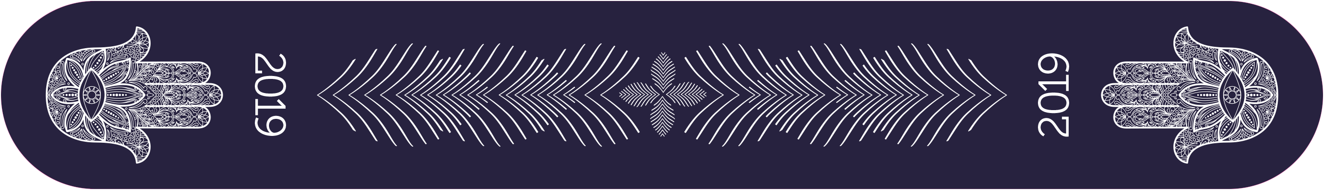
Mazal means "luck" in Hebrew. The founder had expressed interest in incorporating the hamsa, a symbol that traditionaly protects and deflects the evil eye. We developed a corporate logo for the group, ready for possible expansion into other product categories. The typeface is custom designed. A grounded, solid-feel M and low A crossbars aligned with the eye are contrasted with the word group where the stems and legs mirror the hand's contours.
Colour Palette
Argil grey, symbolising earth and cohesion combined with warm teal which is soothing and rooted.
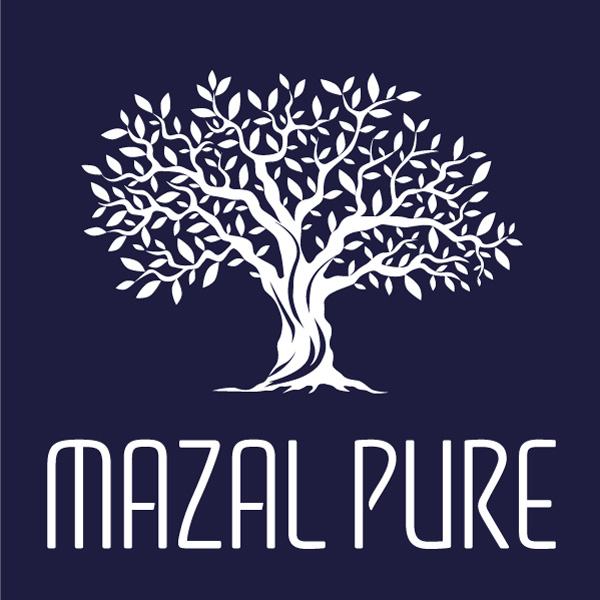
Mazal Pure
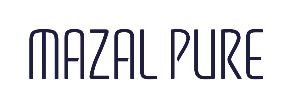
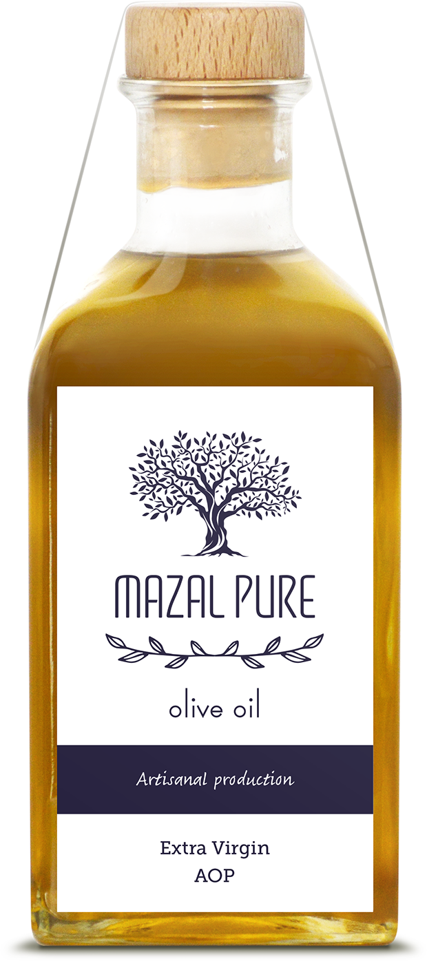
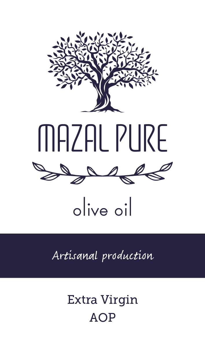
Logo
The Mazal Pure logo is a custom created logotype which resonates with shapes found in Jewish script. The tall cap height is insipired by trees which are core asset of the family business. The character countours communicate a natural and light liquid flow. This qualty is also visible in the tree logo which is associated with product packaging.
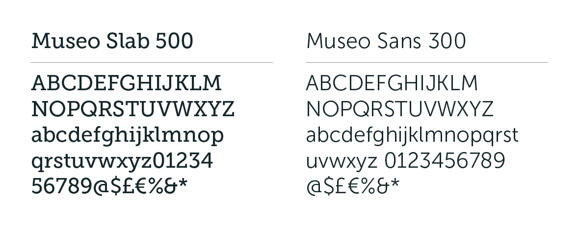
Typography
Museo is a friendly typeface with round non-sinusoidal curves which give it a frank demeanor. Its tall x-height makes it highly legible and it offers good contrast with its slab serif option.
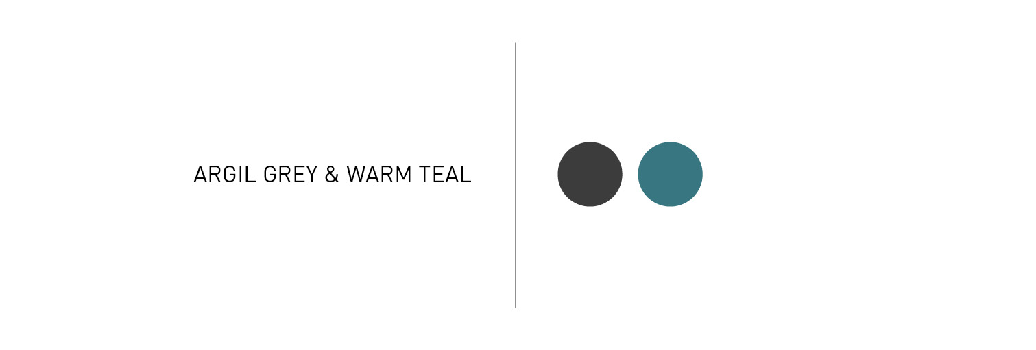
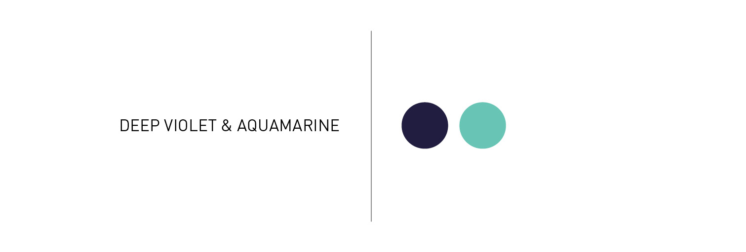
Colour Palette
In order to differentiate from other oilve oil producers who often use green as thier main colour we suggested taking a non conventional colour such as deep violet which contrasts well with the yellow wam tones of oilve oil. We combined this with aquamarine which is often found in hamsa jewelry to create a friendly highlight.
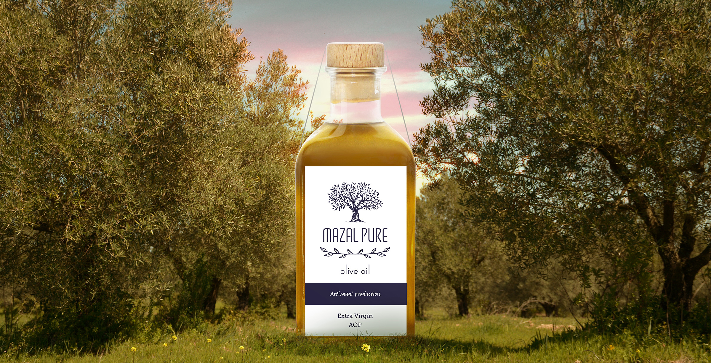
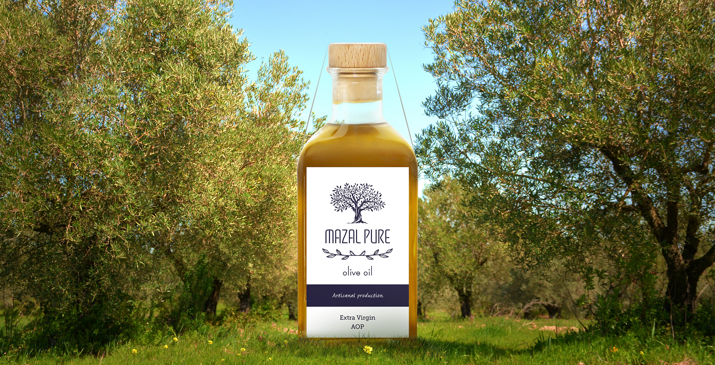
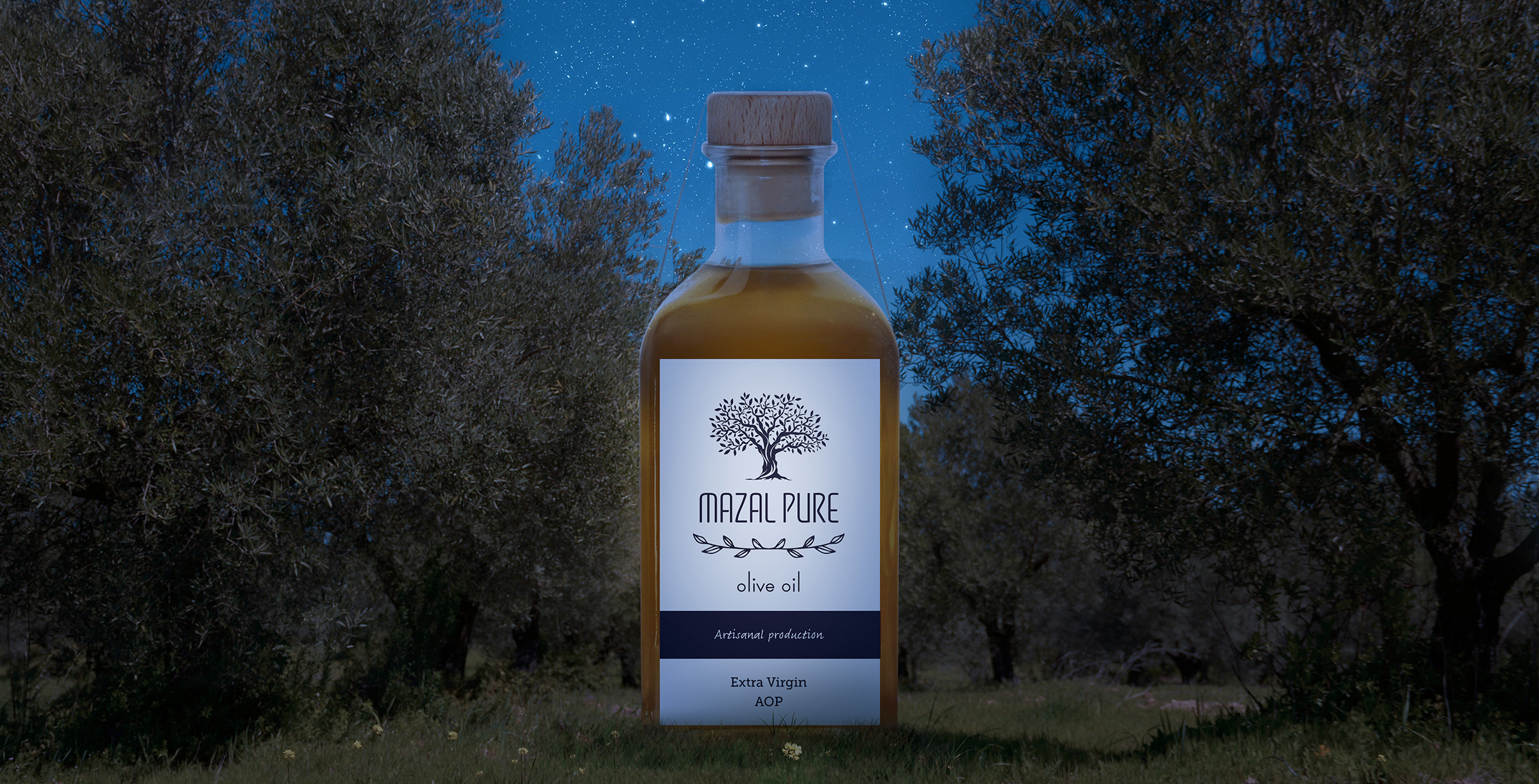
Key Visual
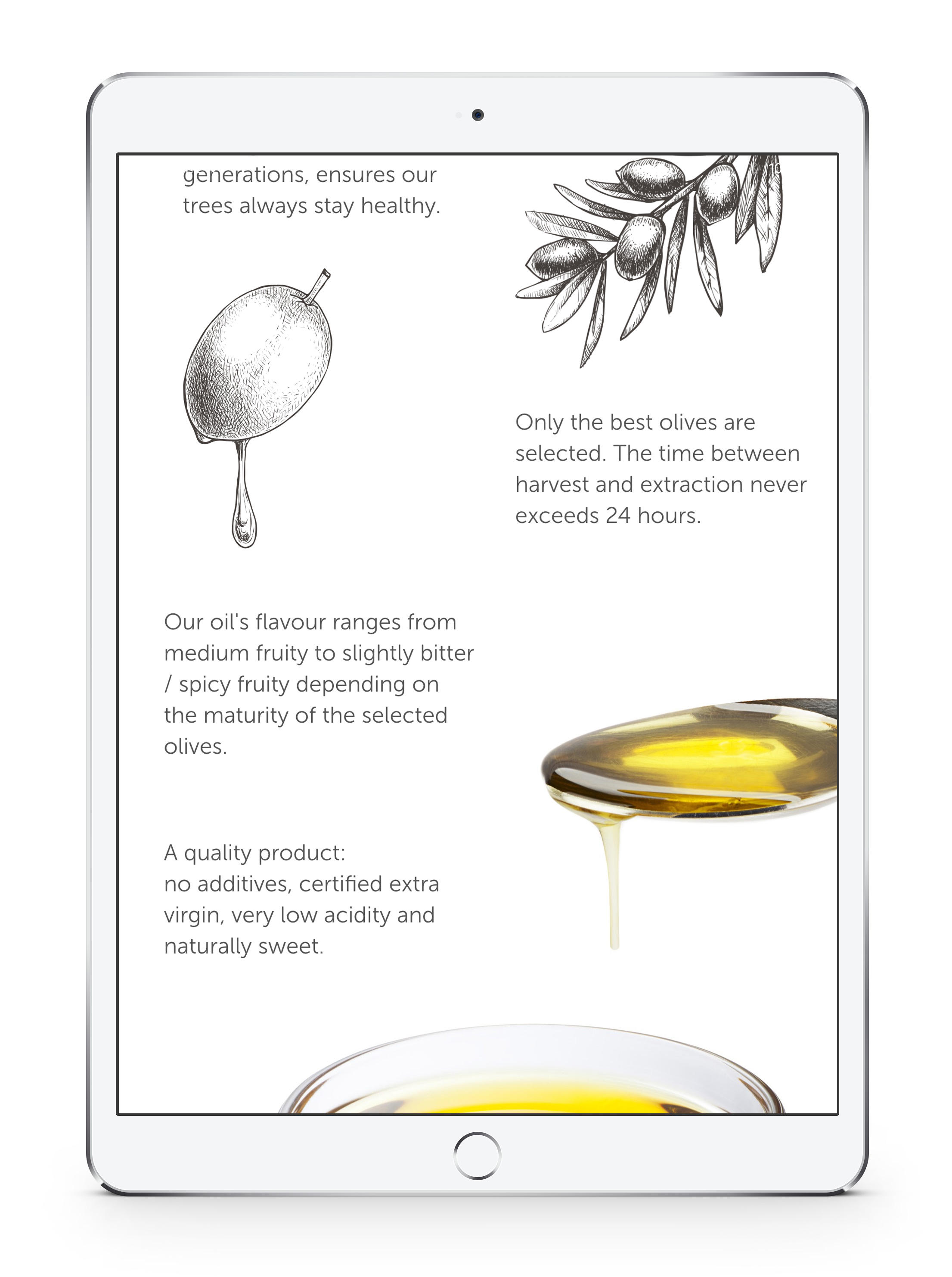
The idea behind these visuals was to reinforce the intimate connection between the final product and its natural origin. As well as presenting a product beautifully, the idea that the circadian rhythm is intrinsic to the product expresses the special bond it shares with nature.
Brand Expression
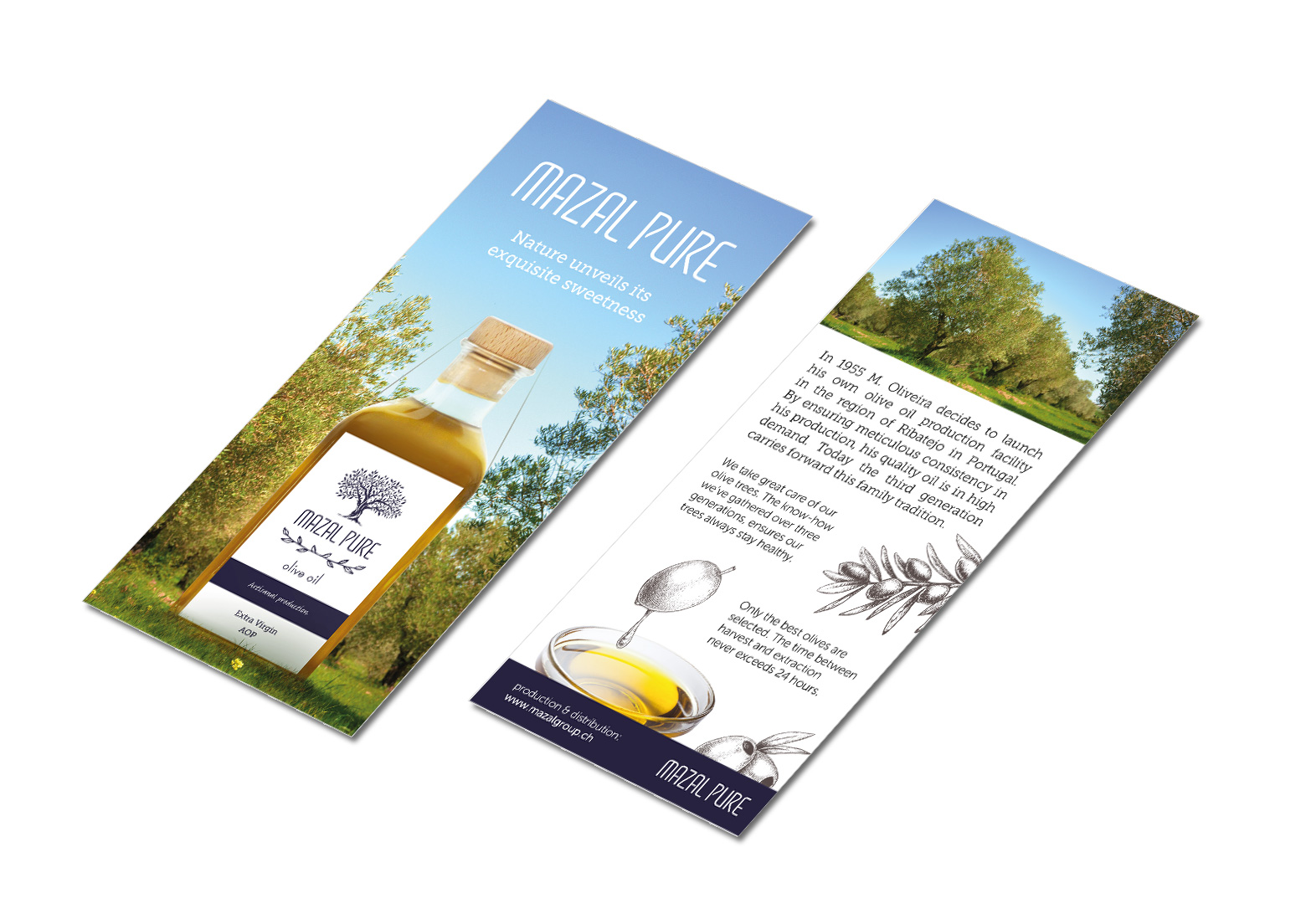
Leaflet
This leaflet is intented to be distributed to retailers and accompany point of sales. We kept the messaging simple, with some information on the company's story and the product. The key message: "Nature unveils its exquisite sweetness" serves to put nature at the forefront, human intevention while being present remains humble.
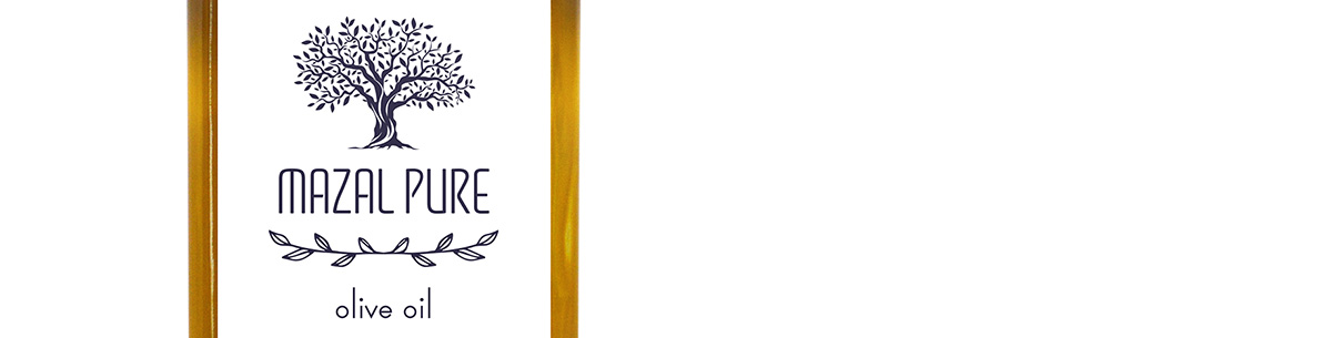
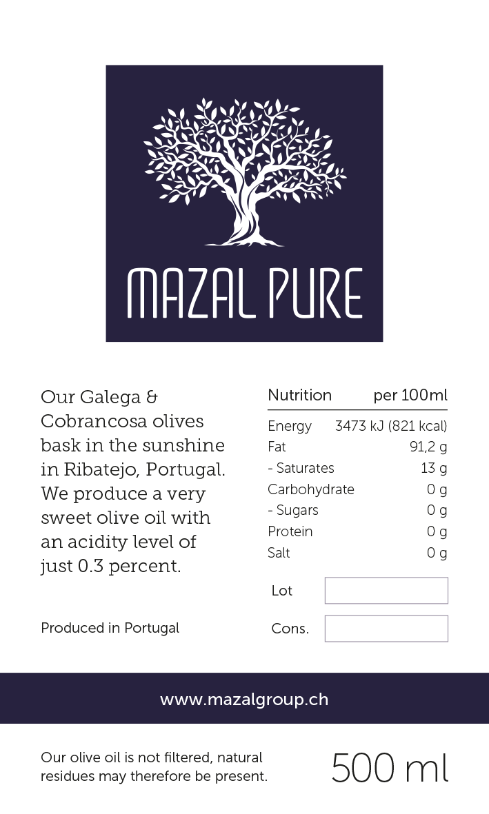
Packaging
We kept packaging labels & seal minimal, looking to create a durable brand that would weather different trends. A style that could help carry forward the three generation familly business. Although the style is understated, combined with the bottle it still conveys the image of a quality, high-end product. The typography used to denote the product type was customized in order to be kept minimal while maintining a high cap height to x-height contrast. As with all brand expression for Mazal Pure, labels were created in three languages (English, French and Portuguese) in order to cover different markets.
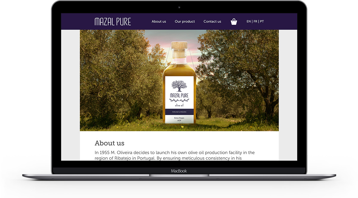
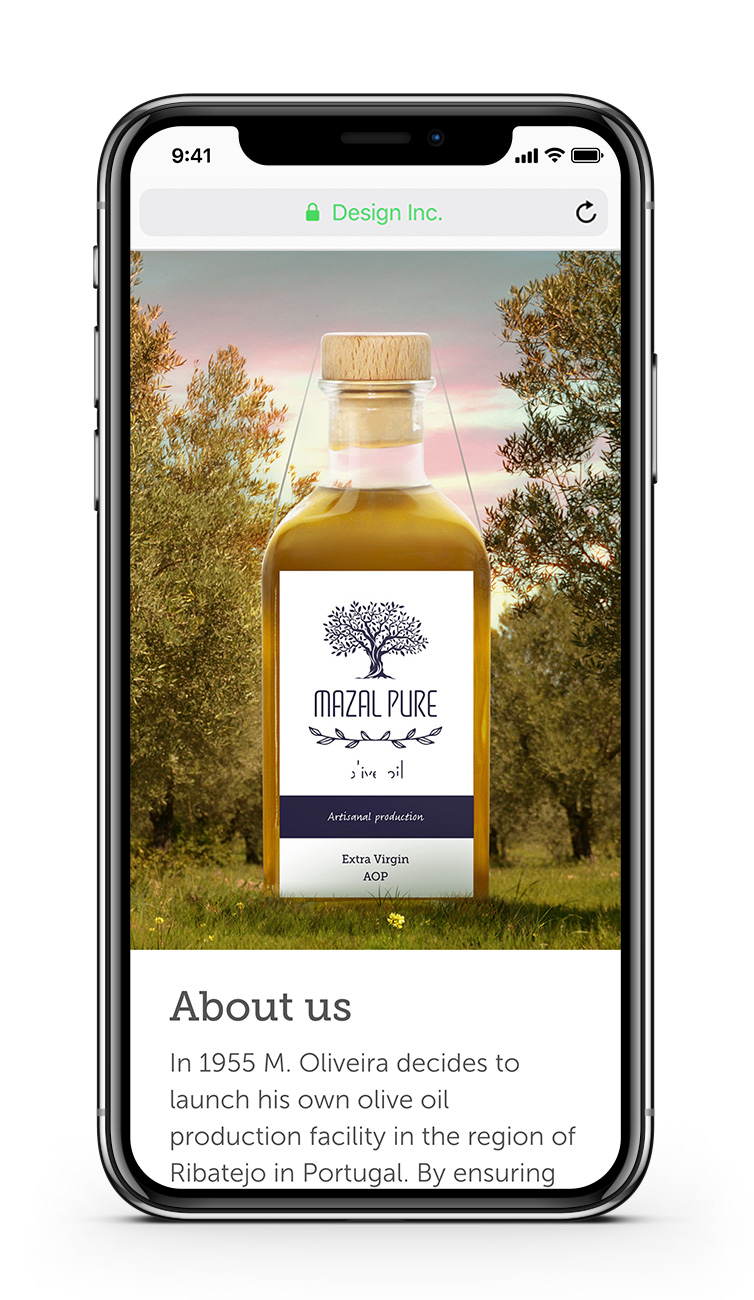
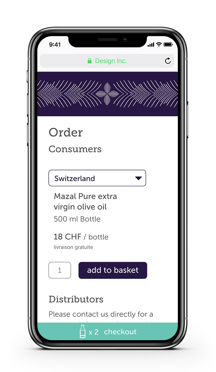
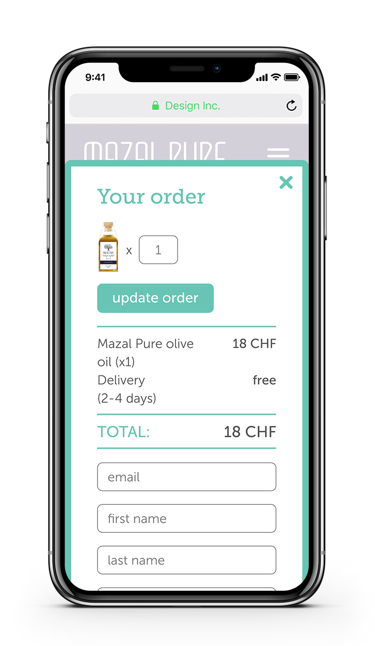
Website
The website features key visuals that change according to the time of the day when the site is accessed. The site is responsive both in layout and typography and enables users to purchase the product from the EU, Switzerland and Brazil. It features a brief background on the business, a product presentation and an order section. The interface was kept minimal with special attention given to the custom checkout experience in order to make it as simple as possible whilst avoiding standard e-commerce templates.
www.mazalgroup.ch
www.mazalgroup.ch