Terra

Terra is a new brand that develops natural and organic hair products for women. We proposed a strategy and an identity that would help the brand gather pace. We also suggested a new format for one of their product ranges.
• Strategy:
Brand stategy and poduct design
• Identity: Logo, Colour palette, Typography, Photography, Naming
• Brand Expression: Packaging, Website
• Identity: Logo, Colour palette, Typography, Photography, Naming
• Brand Expression: Packaging, Website
Strategy
Brand strategy
Terra, a brand name we helped define and grow. Terra selects the right combinations of ingredients provided by mother earth to create organic hair treatments for all hair types.
We emphasized the need to appeal to different ethnic backgrounds.
We emphasized the need to appeal to different ethnic backgrounds.
Product design
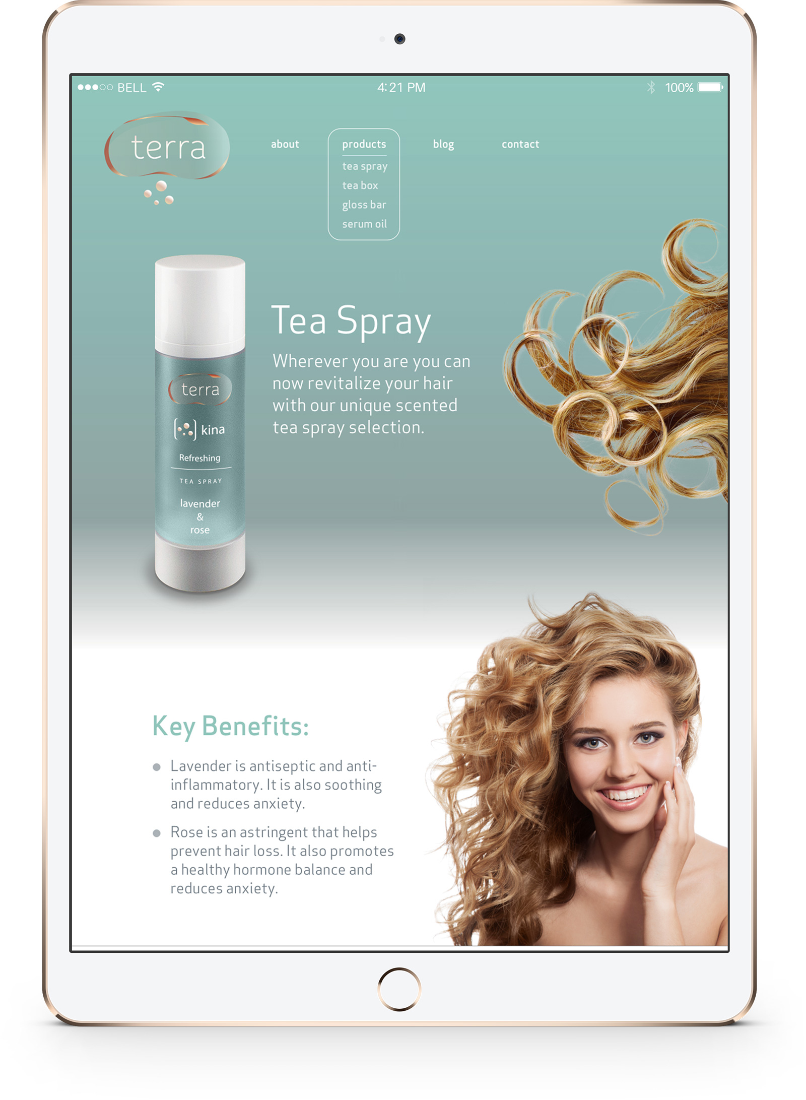
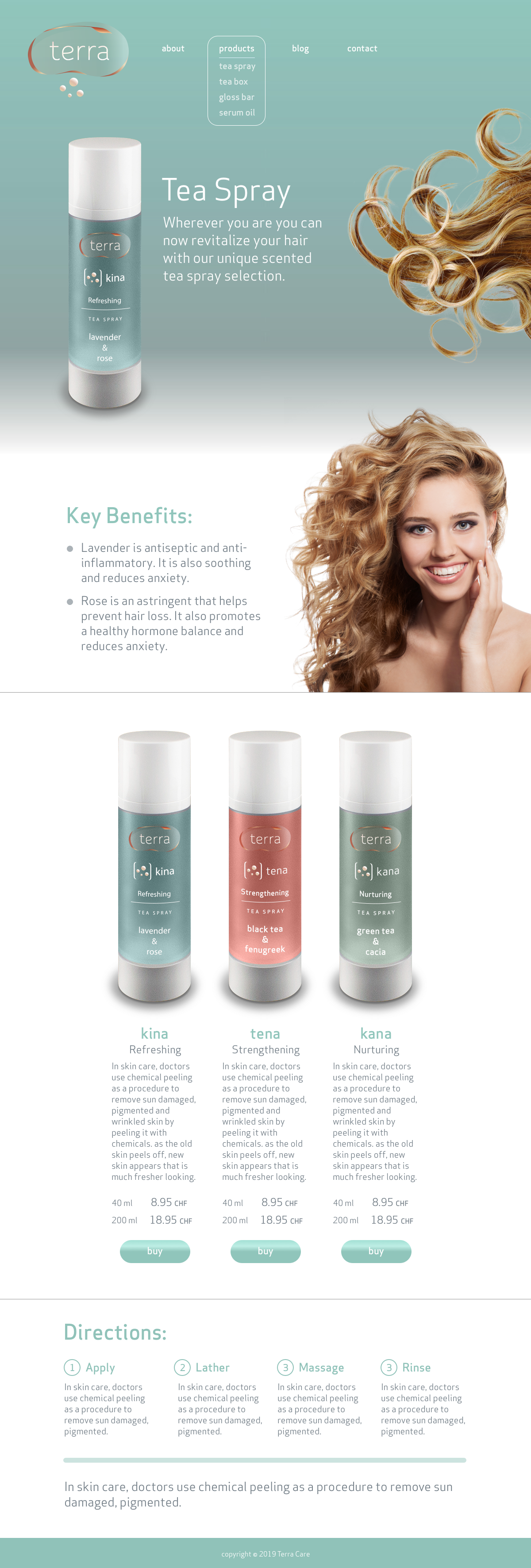
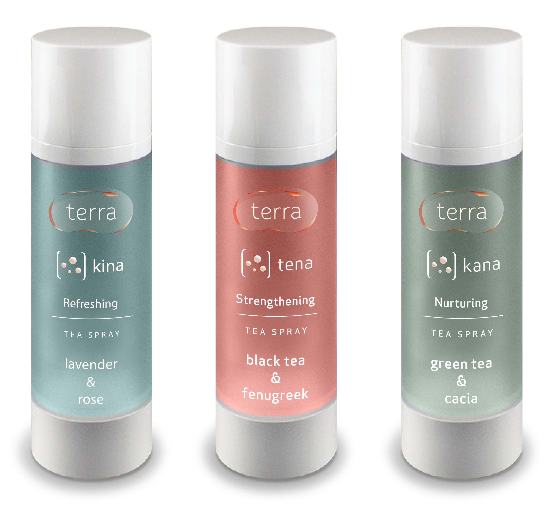
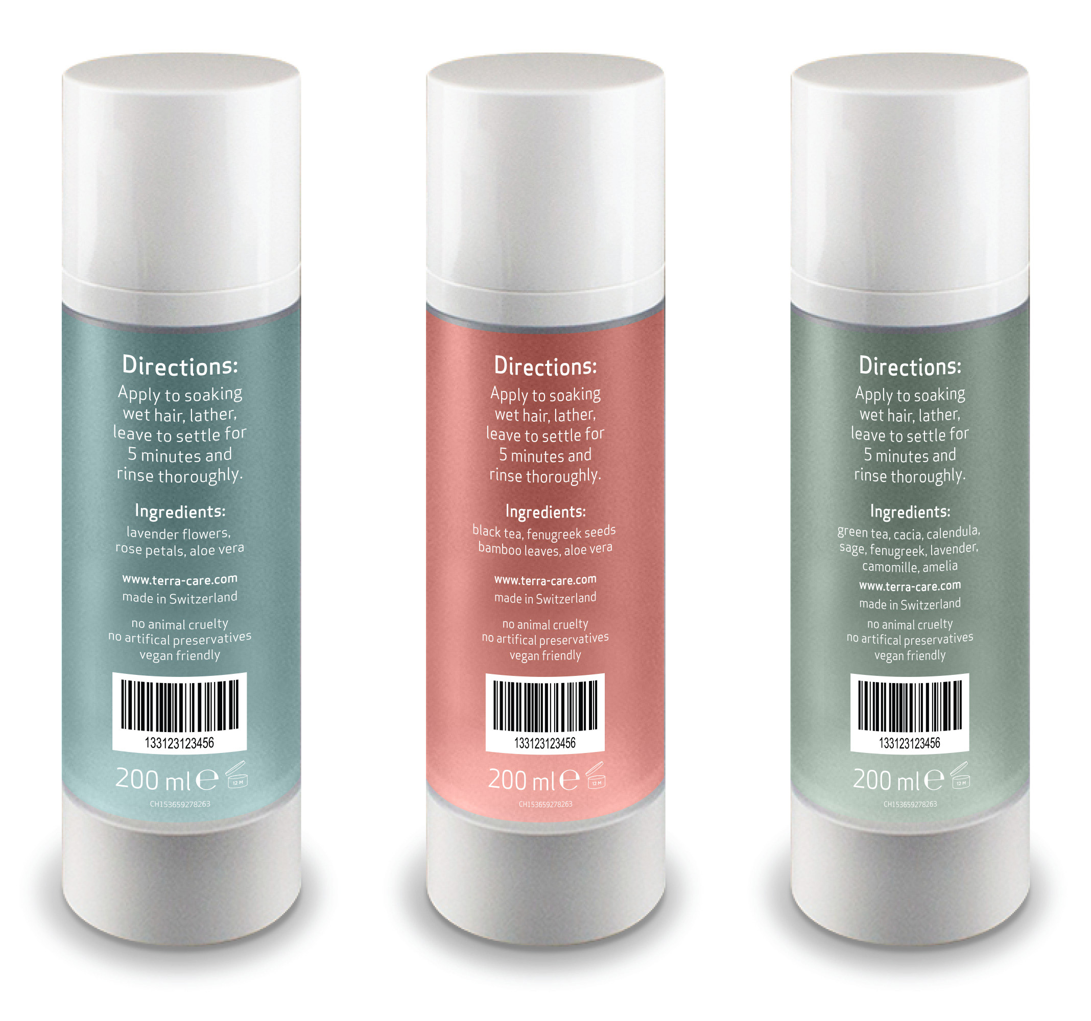
We suggested a new product format for the Hair Tea range. Tea spray increases convenience, customers can freshen up wherever they are. This product format also increases likely adoption by people with busy schedules who don't have the time to prepare the loose leaf formula.
Identity
Logo
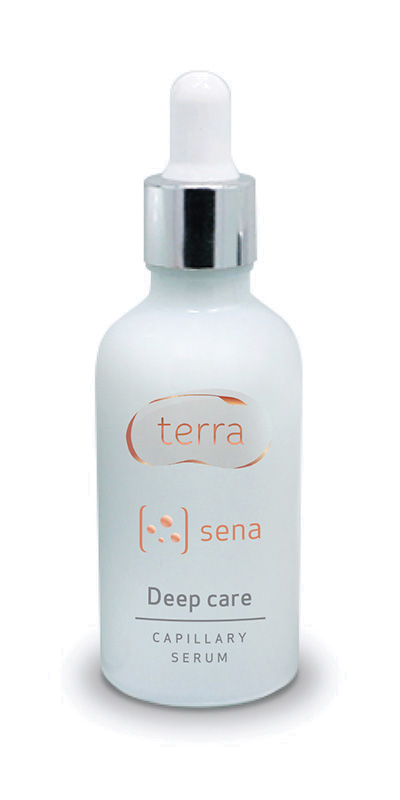
It was important to create a logo that reflects natural ingredients used by Terra. We created a logo with a variety of textures, transparency, matte, shininess, echoing the variety of earth's elements. This results in a logo that is rich in texture contrast while remaining light. The bean shaped bubble and surrounding plant conveys themes of natural growth.
Typography
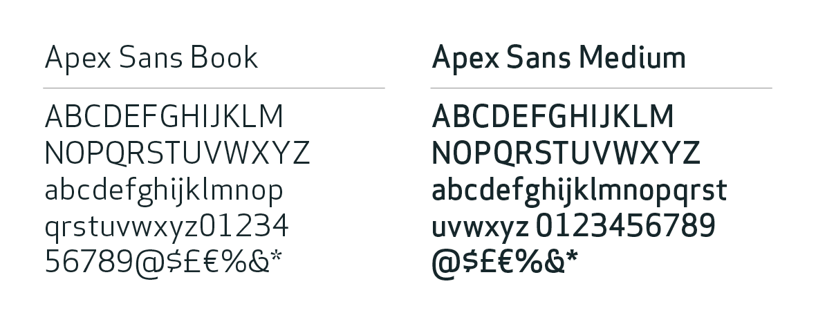
Apex Sans was selected as a font that is modern, scientific, yet rounded and soft.
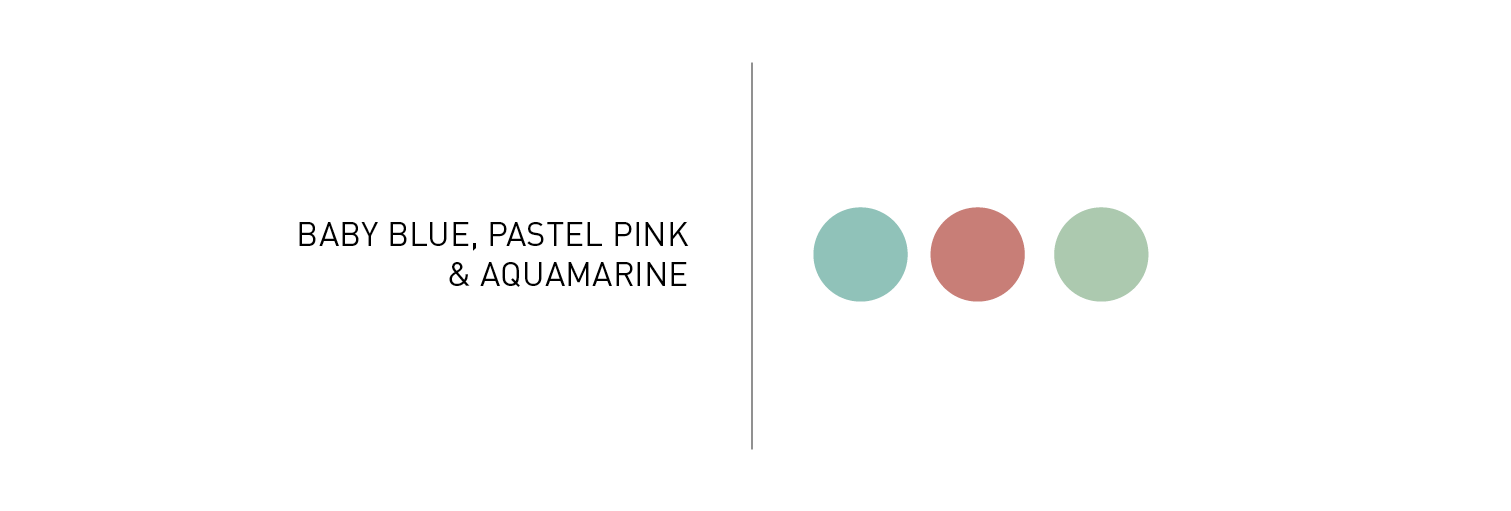
Colour Palette
We used pastel colours which are gentle and feminine without being overly delicate.
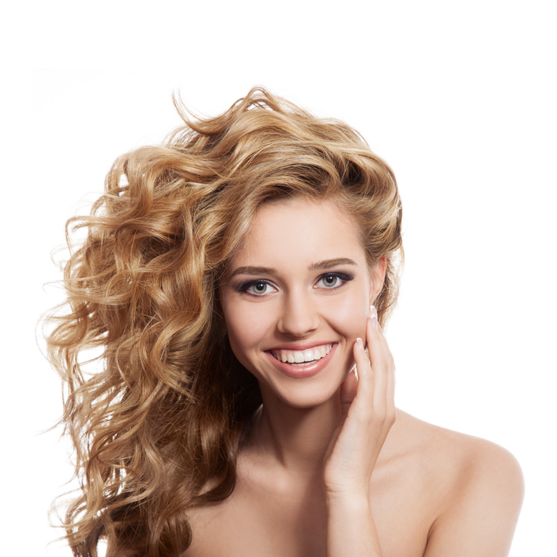
Photography
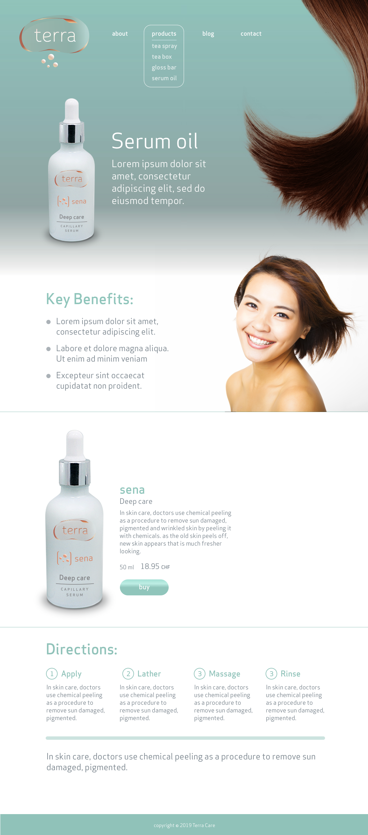
The photography features young women of different ethnicities, with different hair types, unclothed. We are appealing to young women of all social backgrounds, avoiding connotations created by a dress code enables us to reach a wider audience and helps convey a natural and organic feel. This is an organic product for every woman.


Naming
We defined naming conventions for different product types. For example: tea sprays are named with two syllable words, gloss bars with only one. The names were chosen to be:
1) easily pronoucable in multiple languages
2) short and easily memorable
3) connected with the raw and natural
Brand Expression
Packaging
We proposed a packaging that is neutral, practical, adaptable to most situations and within production budget. Label design clearly highlights the product's main quality and principal ingredients.
Website
The website keeps inline with the brand themes of lightness and transparency. It is a product / object led presentation of the Terra range. Each page showcases a different hair type and ethnic background.